SA2020 has been tracking the progress San Antonio has been making toward its goals. That means lots of numbers, lots of analysis – lots of data that is really important, but completely unapproachable. We’ve all seen our fair share of annual reports, data charts, line graphs, pie charts, statistical analysis and data comparisons, and we’ve all thought, “There MUST be a better way to share information without boring me half to death!”
Our challenge, as their digital marketing team, was to make that information friendly, but still meaningful to the general public. Throughout this project, we refined our talent for breaking volumes of data into digestible pieces and designing beautiful graphics that can be shared on the SA2020 website, over their social media channels, and between website visitors.
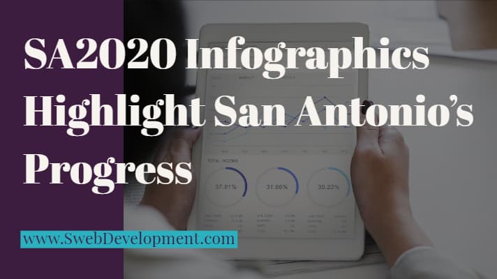
SA2020 consists of 11 causes that citizens identified as important, from Arts & Culture, to Transportation. Each cause’s progress (or lack thereof) is determined based on multiple indicators, for which SA2020 collects data. We then take this data, as it comes in, and create infographics representing the baseline, annual progress, and targets. This gives visitors an easy and fun way to digest the wealth of data that would otherwise be daunting.
We love creating infographics for clients who deal with a large volume of data. If your content creation needs a little pizazz, give us a ring and let’s chat about how we can help you!